The Power of Color in Branding: How It Shapes Perception and Emotion
- Michael Kumordzi Tetteh
- Dec 20, 2025
- 4 min read

Updated: Jan 3
Color is more than just a visual element. It plays a crucial role in how people perceive a brand and how they emotionally connect with it. When you think about your favorite brands, chances are their colors come to mind immediately. That’s no accident. Colors influence feelings, memories, and even decisions. Understanding this power can help businesses create stronger, more memorable brands.
In this post, we’ll explore how color affects perception and emotional response. We’ll also cover important points to consider when choosing colors for your brand, including your target audience, brand personality, and the impact of color combinations.
How Color Influences Perception and Emotion
Colors speak to us on a subconscious level. They can evoke feelings like trust, excitement, calm, or urgency without a single word. For example, red often signals energy or passion, while blue tends to suggest calm and reliability. This emotional response shapes how people view a brand before they even interact with its products or services.
Research shows that color increases brand recognition by up to 80%. That means the right color choice can make your brand more memorable and easier to identify. It also affects buying decisions. Studies indicate that up to 90% of snap judgments about products can be based on color alone.
Here are some common emotional associations with colors:
Red: Energy, passion, urgency, excitement
Blue: Trust, calm, professionalism, security
Green: Growth, health, nature, balance
Yellow: Optimism, warmth, attention
Black: Sophistication, power, elegance
Orange: Creativity, enthusiasm, friendliness
Purple: Luxury, wisdom, creativity
Keep in mind these associations can vary by culture and context, so understanding your audience is key.
Understanding Your Target Audience and Their Color Associations
When selecting colors for your brand, knowing who you want to reach is essential. Different groups may interpret colors differently based on age, culture, gender, and personal experiences.
For example:
Age: Younger audiences often prefer bright, bold colors like orange or red, while older groups might lean toward softer, muted tones.
Culture: In Western cultures, white often means purity, but in some Eastern cultures, it can represent mourning.
Gender: While stereotypes exist (blue for boys, pink for girls), many brands now choose colors that break these norms to appeal to broader audiences.
Ask yourself:
What emotions do I want my audience to feel?
What colors do they already associate with my industry?
Are there cultural meanings I need to consider?
For instance, a brand targeting health-conscious consumers might use green to symbolize wellness and nature. A tech startup aiming for innovation might choose blue to convey trust and intelligence.
Reflecting Brand Personality Through Color
Your brand’s personality should shine through its colors. Think of your brand as a person. Is it playful or serious? Bold or understated? Friendly or exclusive? Colors help communicate these traits instantly.
Here’s how some colors align with brand personalities:
Blue: Reliable, professional, calm
Red: Bold, energetic, passionate
Yellow: Cheerful, optimistic, approachable
Black: Elegant, sophisticated, authoritative
Orange: Fun, creative, inviting
Purple: Imaginative, luxurious, thoughtful
For example, a luxury fashion brand might use black and gold to express sophistication and exclusivity. A children’s toy company might choose bright primary colors to feel fun and energetic.
Matching your color palette to your brand personality helps create a consistent experience that customers recognize and trust.
The Impact of Color Combinations and Contrast
Choosing a single color is just the start. How colors work together can make or break your brand’s visual appeal. Good combinations create harmony and balance, while poor choices can confuse or repel viewers.
Some tips for effective color combinations:
Use complementary colors (colors opposite each other on the color wheel) for high contrast and energy, like blue and orange.
Use analogous colors (colors next to each other on the wheel) for a harmonious, calm look, like blue, teal, and green.
Limit your palette to 2-3 main colors to keep things simple and memorable.
Consider contrast for readability, especially in logos and text. Light text on a dark background or vice versa works best.
For example, a brand using red and green together might evoke holiday feelings, which could be great or distracting depending on the context. A tech company might combine blue and gray for a clean, modern look.
Testing your color combinations in different formats (print, digital, merchandise) is important to ensure consistency.
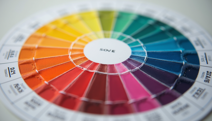
Color wheel showing relationships between hues to help choose effective brand palettes
Practical Tips for Clients Requesting Design Work
When you work with designers, clear communication about color is key. Here are some points to keep in mind:
Describe your target audience and any relevant cultural or demographic details. This helps designers pick colors that resonate.
Explain your brand personality in simple terms. Use adjectives like “friendly,” “serious,” or “luxurious” to guide color choices.
Share examples of colors or brands you like and why. Visual references speed up the process.
Discuss where your brand colors will appear (website, packaging, signage) so designers can consider contrast and visibility.
Ask about color psychology and how certain colors might affect your audience’s emotions and behavior.
Remember, color is a strategic tool, not just decoration. The right choices support your brand’s story and goals.
Real-World Examples of Color Impact in Branding
Coca-Cola’s red signals excitement and energy, fitting its image as a fun, refreshing drink.
IBM’s blue conveys trust and professionalism, aligning with its tech and consulting services.
Starbucks’ green reflects growth, nature, and calm, matching its coffeehouse vibe and commitment to sustainability.
Tiffany & Co.’s robin egg blue creates a unique, luxurious feel that customers instantly recognize.
These brands carefully chose colors that support their identity and appeal to their audiences.
Final Thoughts on Using Color to Shape Your Brand
Color is a powerful way to shape how people see and feel about your brand. It influences recognition, emotions, and decisions. By understanding your audience, reflecting your brand personality, and choosing effective color combinations, you can create a brand that stands out and connects deeply.
Next time you think about your brand colors, remember they are more than just pretty shades. They tell your story without words. Use them wisely to build a strong, lasting impression.
If you’re planning a new brand or refreshing an existing one, take time to explore color options with your designer. Test different palettes and consider how each color makes you and your audience feel. The right colors will help your brand speak clearly and powerfully.


Comments